
|
In the last post we discussed colour families, the difference between colour schemes and palettes and of the different types of colour schemes. In this post I want to delve deeper into colours and talk about warm and cool colours and about how to use them. Also what the heck is SHTT? If this is your first visit here, welcome! There is a Let's Talk About Colours Part 1 in a previous post. It's in this post where you'll be able to download a RYB colour wheel to print for a reference. For those of you who already have your colour wheel, you may want to grab it before you proceed. Warm and Cool Colours If you were to draw a line starting from in between the colour purple and magenta straight across the colour wheel circle to in between chartreuse and yellow, you will have divided your wheel into cool and warm colours. All colours from magenta to yellow are warm colours and all colours from purple to chartreuse are cool colours. I kinda think that chartreuse could be considered both and that’s okay too. If you think of colours that reflect daylight, like a sunrise or sunset then you are thinking of warm colours. If you think of colours that reflect water or the sky then you’re thinking of cool colours. I was thinking about the seasons of the year and how the colours represent them. Spring and Summer are represented will using both warm and cool colours, Autumn by using warm colours and Winter by using cool colours. When making colour choices for card making, always take these into consideration, the theme for the card, the time of year and the most important one of all is the person that the card is being made for. Does that person have a favourite colour? Usually when you have one colour down it’s easy to find other colours to go with it by using a colour scheme. Let's quickly talk about Saturation. The more saturation a colour has the more vibrant and intense the colour is, when the saturation of a colour is decreased the colour becomes darker. A very low or no saturation of a colour will make it look grey. What the Heck is SHTT? Well when you sound out the acronym it’s definitely not hard to forget *chuckle. SHTT stands for Shade, Hue, Tone and Tint. Have you ever used a photo editing program? Now most smart phones have fancy cameras and a photo editing program along with them. If so then you may be familiar with how these work. Hue is the dominant colour family of a specific colour. Pink is a mix of colours but the dominant hue would be red. Tint is when a colour has been lightened, this can be achieved by adding white to lighten the colour. Pastel colours are a result of tinting. Shade is when a colour has been darkened by using the colour black. I like to think of standing in the shade of a tree. There is less light and so everything is darker. Tone is when a colour has been mixed with equal amounts of black and white, or pure grey, it doesn’t darken the colour like shading but it does dull the intensity of the colour. The colour wheel below shows the difference of each. 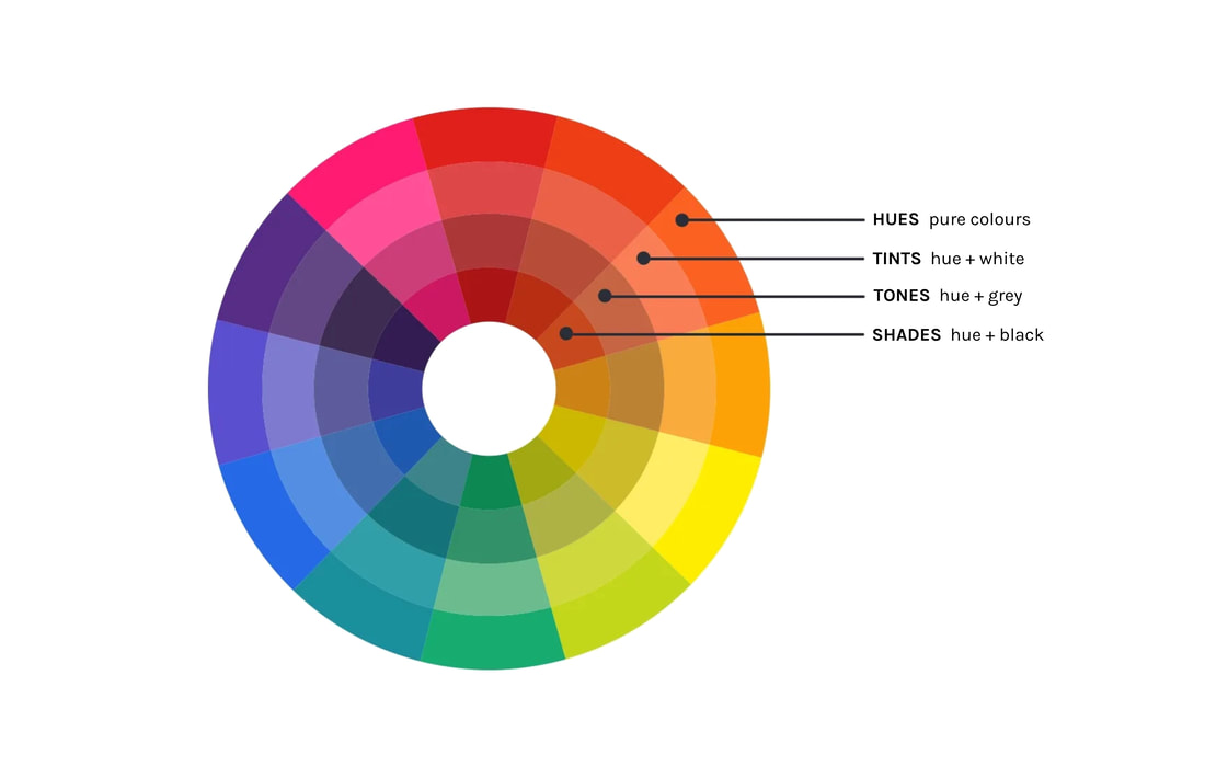 Now that we’ve learned about SHTT, we can discuss what a monochromatic colour scheme is. Monochromatic Colour Scheme A monochromatic colour scheme is when you use all of the varieties of one hue. Adding a tint, a shade and a tone to one hue will create a range lighter and darker versions of this colour. You can make a greeting card using this colour scheme too. Here is an example of a monochromatic colour scheme 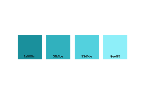 I hope this helps when it comes to choosing colours for your card making.
Thanks for stopping by! Anita
0 Comments
 downloadable RYB colour wheel downloadable RYB colour wheel A question I'm often asked is how do I know which colours to use when I'm making a card? So today I thought let's talk about colours.
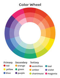
Sometimes choosing colours for a project can be frustrating. Seeing what colours look good together, complement one another and go along with whatever your theme is. I’ve found that having some sort of reference available in my studio helps me the most. So I worked on a standard RYB colour wheel that you can print and use for reference. A RYB colour wheel is a color wheel that’s derived from the primary colors, R-red, Y-yellow and B-blue. Every colour that exists comes from these three primary colors. Now keeping that in mind, did you know that there are three main colour families? They are Primary, Secondary and Tertiary. Let's delve into this more so we can have a clear understanding of how this works. Primary Colours Primary colours are the three main colours that all other colours derive from they are blue, yellow and red. Secondary Colours Secondary colours are when two primary colours are mixed together. blue + red = purple red + yellow = orange yellow + blue = green Tertiary Colours These colours come from mixing a primary colour with a secondary colour. There are six tertiary colours. blue + purple = violet purple + red = magenta red + orange = vermillion orange + yellow = amber yellow + green = chartreuse green + blue = teal Below you can find a colour wheel to print as a reference. The colour families and the colours in each family are there for you. Now let's talk about choosing colours to use for card making. First there is a difference between a colour scheme and a color palette. A colour scheme is the strategy for choosing your colours and a palette is a collection of colours that you’ve chosen. You can find colour palette generators online for a quick and helpful way to find inspiration. Since colour palettes come from colour schemes let's go over what types of colour schemes there are. Complementary Colour Schemes Complementary colours are on the opposite sides of the colour wheel. You'll get maximum contrast on your card by using this combination because it's so vibrant. If your theme for your card is loud a complementary colour scheme will work well. Split Complementary Colour Schemes Split complementary colour schemes are great to use as a beginning card maker. An example on how to pick this colour scheme, take the colour red, it's complementary colour would be green. To create the split complementary you would choose the colours on either side of the green. So your colour scheme would consist of red, teal and chartreuse. Another split complementary colour scheme would be to choose colours that are two away from the complementary colour. For example lets use the colour magenta its complementary colour is chartreuse. The colours that are two away from either side of chartreuse are teal and amber. So the colour scheme would consist of magenta, teal and amber. You can also use this same method by choosing colours three away from the complementary colour, as long as the colours you choose are the same distance from the complementary colour. Analogous Colour Schemes Analogous colour schemes are sets of three colours that all sit side by side on the colour wheel. For example in the colour wheel that you’ve printed, if you start with green, then chartreuse and yellow, that’s an analogous colour scheme. The three colours when used together create a serene and soothing feeling. If your theme for your card is soft or comforting then using analogous colours will work well. Triadic Colour Schemes Triadic colour schemes consist of three colours that are spaced evenly from each other on the colour wheel. One triadic colour scheme would be green, purple and orange. See how they form a triangle on the colour wheel. This colour scheme works best when you choose one colour to be the main colour. An example would be your card base would be your main colour and the other two colours would be used to complement the background colour. You can also use the main colour along with your complementing colours. Tetradic Colour Scheme Tetradic colour schemes are made up of four complementary colours. There is a rectangle tetradic colour scheme. This is where you choose one set of complementary colours and then move over one space from you complementary and then choose that colour and it’s complementary. Here’s an example, let’s take the colour chartreuse on our colour wheel, it’s complementary colour is magenta, that’s our first two colours. Now let’s move two colours over to the left of chartreuse, you should have teal. The complementary colour to teal is vermillion, so your tetradic colour scheme would consist of chartreuse, magenta, teal and vermillion. There is also a square tetradic colour scheme. This is where you would choose four colours that are evenly spaced from each other on the wheel, thus forming a square shape. An example of a square tetradic colour scheme would be red, green, violet and amber. So now that we know how to create a colour scheme, next time I’d love to delve in deeper on colours and talk about warm and cool colours, and how and when to use them. Also what is SHTT? Thanks for stopping by! Anita Click the picture below to download the RYB colour chart As this is the beginning of a new journey for me I'd like to introduce myself. Hi, my name is Anita Christensen and I'm the author behind this blog, the owner of YYC Crafts and also the maker behind everything you'll see here. When I'm not in the studio creating I love to read, write, hike and dance. I did start taking dance lessons in my 40's for jazz, tap and ballet. I've always loved dancing and the lessons opened up a whole new side of myself that I didn't even know existed.
I'm very much an introvert, I love my solitude and the comfort of home. I do enjoy gathering with friends, and being social sometimes but I really need to know someone before I can get comfortable with them, which makes being the face behind a business difficult. Also being shy, I have a hard time starting conversations or coming up with small talk. Maybe writing this blog will help me be more conversive. Um......what else can I tell you about me. I'm a mom, both of my kids are young adults and I'm a stepmom to three, all adults with their own families now. I have three pets a dog she's a yorkshire terrier named Mocha and two cats, Spice a female brown tabby and Fuzz a male orange tabby. My intentions with this blog will be to talk about my crafting, what I do in the studio, some behind the scenes stories. Also I want this blog as an outlet for myself to share me with you. I'll talk about things going on in my life, maybe my point of view on stuff. I'm excited to be here and I want to thank you for being here too. Without you this would all be for nothing. See you in the next post, Anita |
AuthorHi, my name is Anita Christensen and I'm the owner and maker behind YYC Crafts. When I'm not in the studio creating I love to read, write, hike and dance in the kitchen while cooking dinner for the family. ArchivesCategories |
 RSS Feed